Visualizing Quantitative Data: A lesson in identifying untapped insight
Each week at Marketing Works, we try and feature a presentation at our staff meetings. This may be from a fellow worker, vendor or anyone that seems relevant to our development as a company. Last Monday it was my turn to present and I chose a topic related to a recent project.
At the beginning of the project we were presented with a great deal of information – most of it qualitative*. I was then assigned with the task of representing this qualitative information in graphic form. Roadblock. Visually representing words (or content) is a daunting task upfront. How else should I display a word other than in a sentence?
Refusing to succumb to defeat, I delved into research, focusing on the visualization of quantitative data. It’s an interesting subject, offering more than a few remarkable solutions to the given problem.
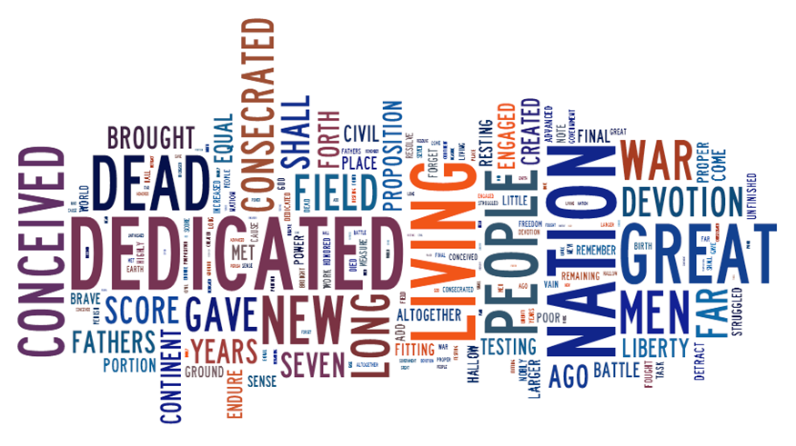
One of the best and most user friendly solutions I came across was Tagxedo. Self described as a service that “turns words into a visually stunning word cloud,” Tagxedo is an amazing resource. What is a word cloud you ask? A word cloud is an aggregation of content (say a speech) into a cloud of words. Words that occur more frequently in the content appear larger in the cloud. To give you an example, here is a word cloud of Abraham Lincoln’s famous Gettysburg Address.
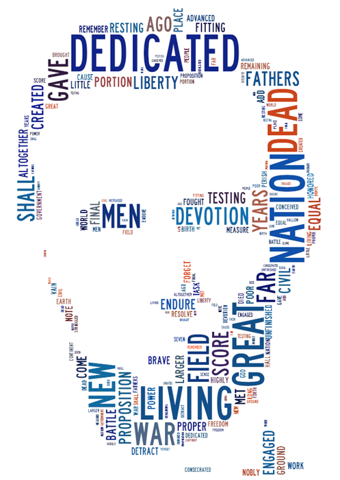
The versatility of Tagxedo is amazing, as it allows you to customize font, color and even shape of your word cloud. Do you want your word cloud from the speech to actually look like Abraham Lincoln? Not a problem:
Now before you get sidetracked with how many cool pictures you can make, let’s take a step back and look at the value of the service.
The goals of visualization are as follows:
- Organization
- Exploration
- Interpretation
- Presentation
By creating this word cloud, we were able to quickly organize the content of the speech into single words. Exploring the cloud, we can see that certain words stand out in size, relating to their high frequency. We interpret these high frequency words as those that are highly important in the speech, allowing us to pull out caveats. Nation. War. People. Dead. Dedication. New. We are able to present this as a quick visual aid when trying to explain the themes within and purpose of the Gettysburg Address.
Ben Shneiderman was nothing but accurate when he said, “The purpose of visualization is insight, not pictures.”
But what does this all mean to me? Many don’t realize how much qualitative information they are actually exposed to. It’s an untapped resource for unparalleled insight. A couple examples you might run into are:
- Social Media content
- Webpage copy
- Notes
- Interviews
- Focus group feedback
- Open-ended survey responses
I challenge you to take your content and run it through Tagxedo. See what insights you can glean and turn into surprising feedback for your client.
*For those who are unaware, there are two general categorizations for information: quantitative and qualitative. Quantitative information can most simply be described as “number” information. This includes any measurable data, such as temperature or weight. Qualitative information is more content driven. Categorization is not determined by numbers, but more intangible factors.
Mworks740 • March 28, 2012
Posted in these categories:
Marketing TipsWith these tags:
Data representation, marketing, marketing resources, Marketing Works, Qualitative data, real time content, social media

