It’s hard to believe it’s been six years since the iPhone first came out! The introduction of iPhones into the mobile sphere greatly increased the popularity of mobile devices and continues to do so today. Mobile devices have not only provided more ways for people to communicate with each other, but have provided another outlet for brands to deliver content to consumers, clients and other businesses.
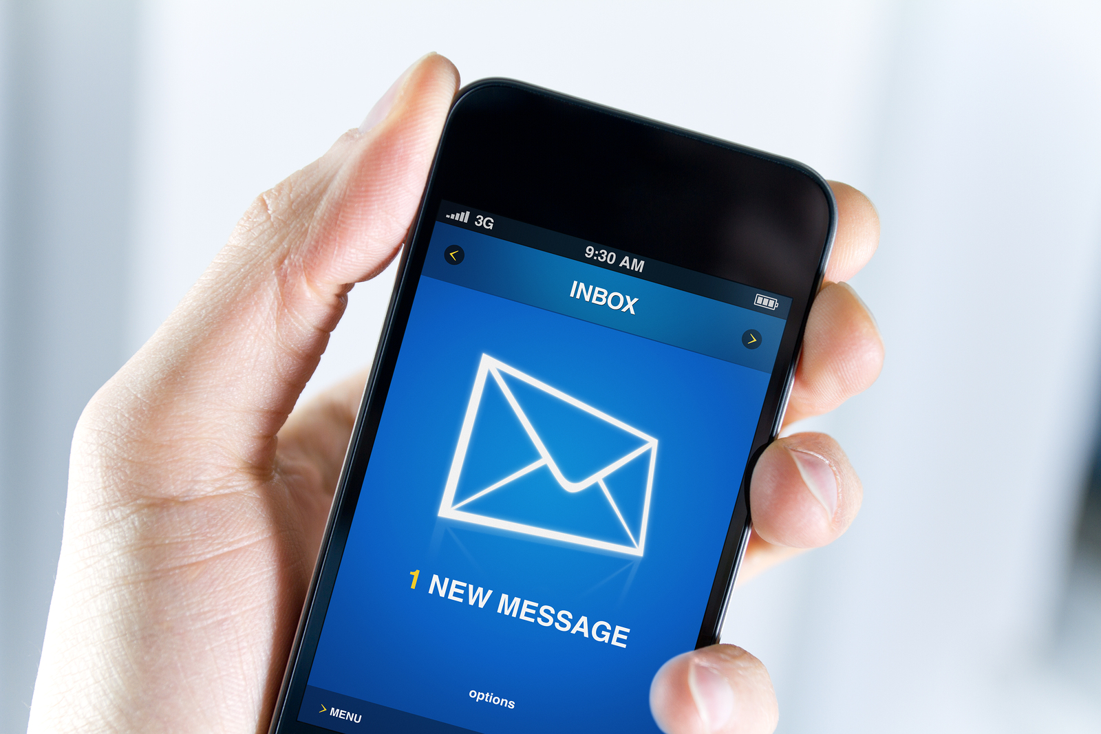
Aside from social media and mobile applications, devices are heavily used for managing email. After all, 65 percent of emails are opened on mobile devices. Therefore, it is extremely important to make sure your emails are optimized for receipt on a mobile device. If you are planning to launch an email marketing campaign in the near future, you’re in luck! We’ve put together some important pointers to keep in mind to ensure your content is optimized for viewing on a mobile device.
1. Use mobile-friendly URLs. While Responsive Web Design is a trend that we keep hearing buzz on, not all websites have converted to a mobile-friendly layout. It is important to test out the URLs provided within your email campaigns before distributing it to your database. This will ensure that they are compatible for viewing on a Smartphone.
2. Stay cautious when inserting images into your email. Including images in your email is essential, since visual content is more appealing than text, but it is important to do so with caution. Images can increase the chance of an email being flagged as spam. If you do include an image, make sure to properly use alt tags so you can convey your message to users who opt out of downloading images.
3. Enlarge the type size. Type appears much smaller on a mobile device that it would on your PC, so it is imperative to enlarge your type. Make your email mobile friendly by using size 14 for regular type and size 30 for headers.
4. Ensure content is adaptable from PC to mobile viewing. When using a template or custom design that formats your email into multiple columns it will likely be difficult to view on a mobile device. These complicated templates might look nice on a PC but provide a disorganized look to mobile users. Consider using a mobile-friendly template or custom design to avoid this issue.
What other tips do you have to optimize emails for mobile devices? Let us know by leaving a comment!