Southeast Healthcare is a Federally Qualified Health Center providing comprehensive services in eight Ohio counties.
Southeast specializes in behavioral health and primary care as well as dental, in-house pharmacy, homeless and vocational services. They are dedicated to improving the lives of their patients and helping those in the community who may not have normal access to healthcare. Southeast had been using the same brand and messaging since its inception in 1978, and realized they lacked an emotional connection with their patients. They knew it was time for a change and contacted Marketing Works to help them enhance their overall brand image, without losing the name recognition they had built over the last four decades. They also needed to effectively communicate their services and programs internally and externally.
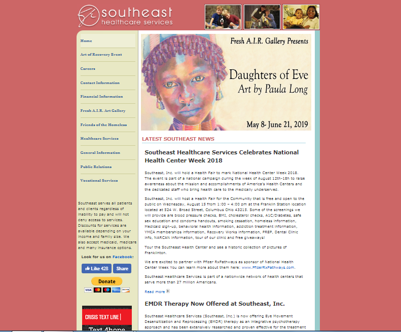
Through extensive research, collaboration and regular meetings with the client, Marketing Works determined Southeast did not need a full name change, but could successfully enhance their brand through a modified name change – from Southeast, Inc. to Southeast Healthcare. This small change was a better representation of who they are and what they do. To create a more emotional connection with its audiences and to more accurately reflect their mission, vision and services, Marketing Works recommended a new logo and color palette. Additionally, Marketing Works recommended a new online presence for Southeast, through the creation of a new, mobile-friendly website. The goal of this website was for it to have more functionality and to be a teaching tool to educate the community and effectively convey Southeast’s mission, services and program offerings.
Marketing Works established a new color palette, logo, corporate stationary package, collateral materials, brand identity guidelines and a new mobile-optimized website. The new brand consists of blue, which is a common color used in the healthcare field, and green, which signifies life and healing. The new logo mark incorporates the “S” in Southeast and the round, globelike mark taken from the “Recovery Sculpture” that sits outside its headquarters, and reflects the courage of millions of people with mental illnesses. The new website incorporated all new brand elements and came with a new domain to match the new, modified name: southeasthc.org. It was built in a WordPress platform so the client can maintain it moving forward.
Marketing Works also helped Southeast promote the new brand and online presence by creating a brand launch plan and timeline. All facets of the plan communicated and shared the new brand with its employees, stakeholders, and the public. The plan included emails for internal communication, a press releases and social media content.
- A modern, refreshed brand to remain relevant in the healthcare field
- Allow patients and prospective patients to quickly get the info they need
- Educate internal and community stakeholders about mental illness, addiction studies, and routine medical care